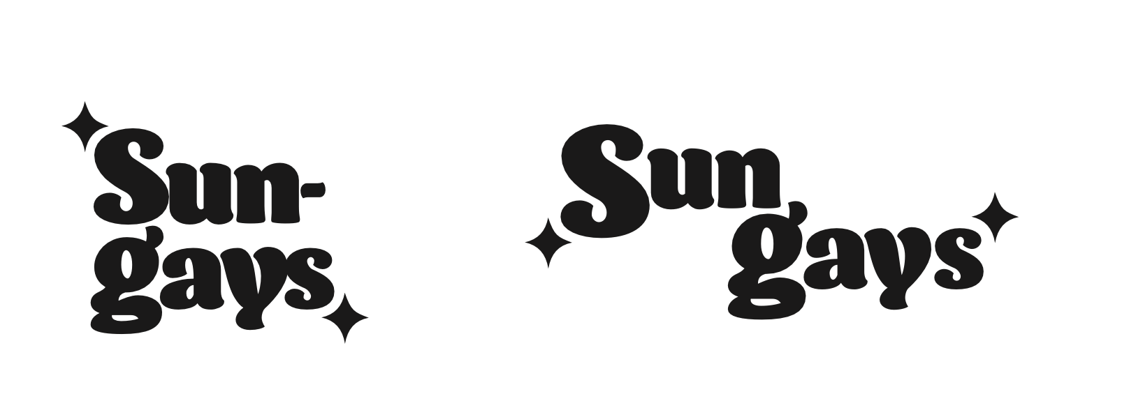
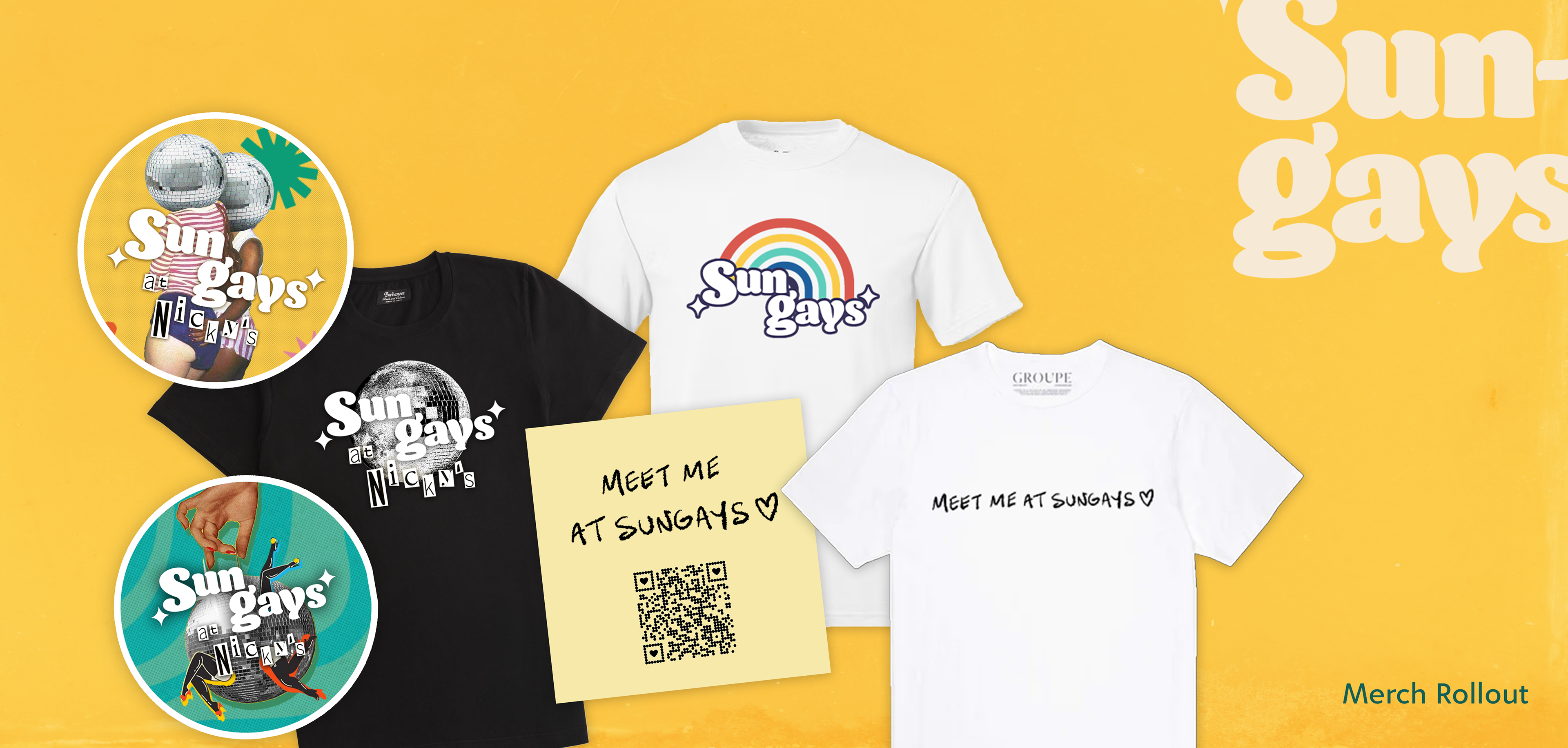
Logos
Typography
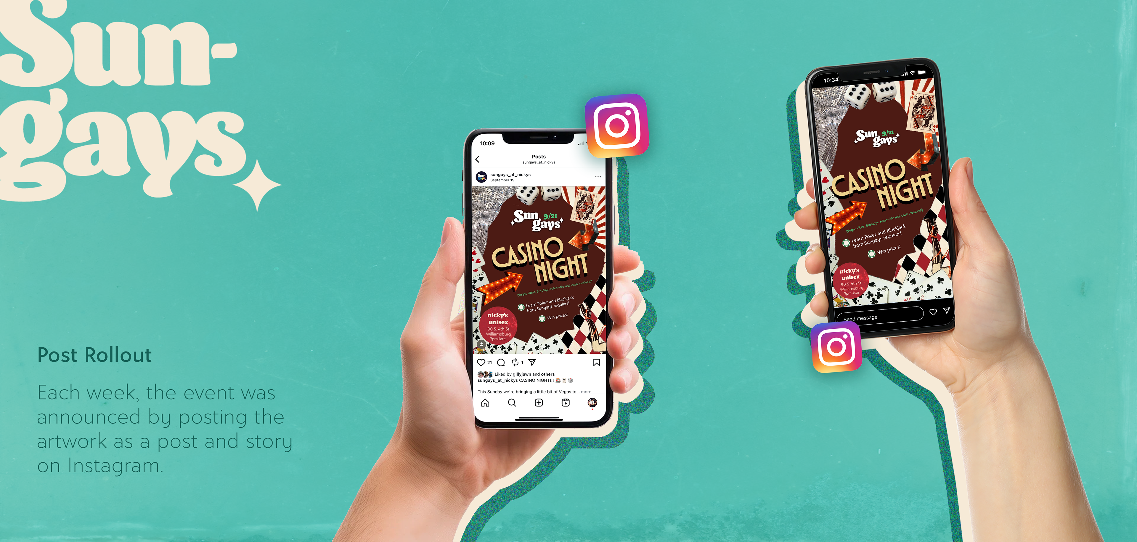
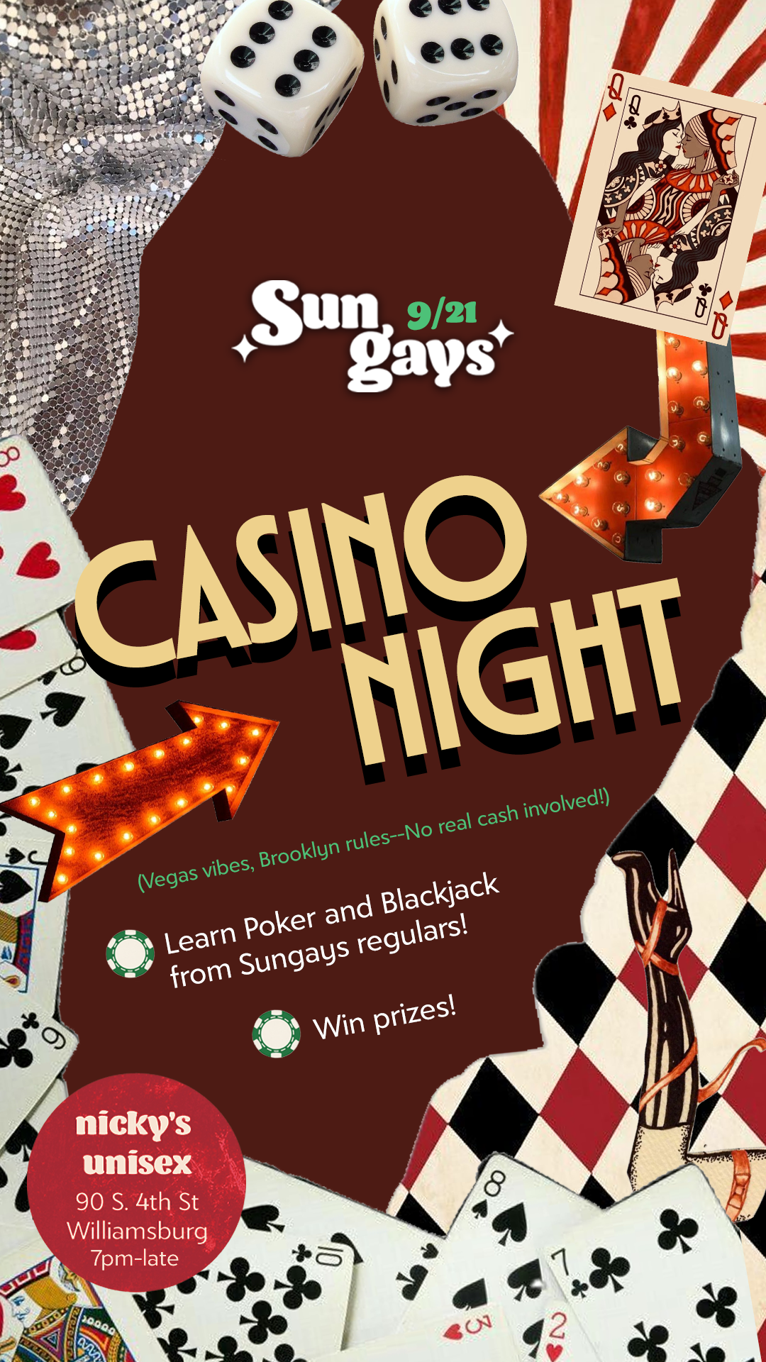
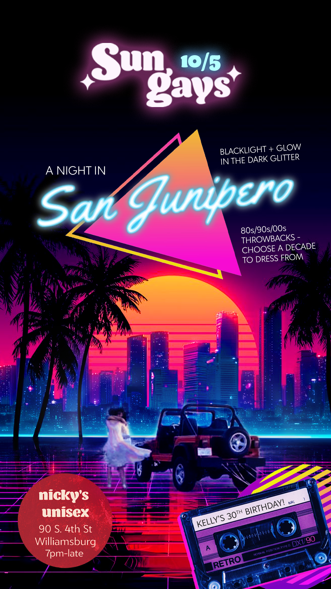
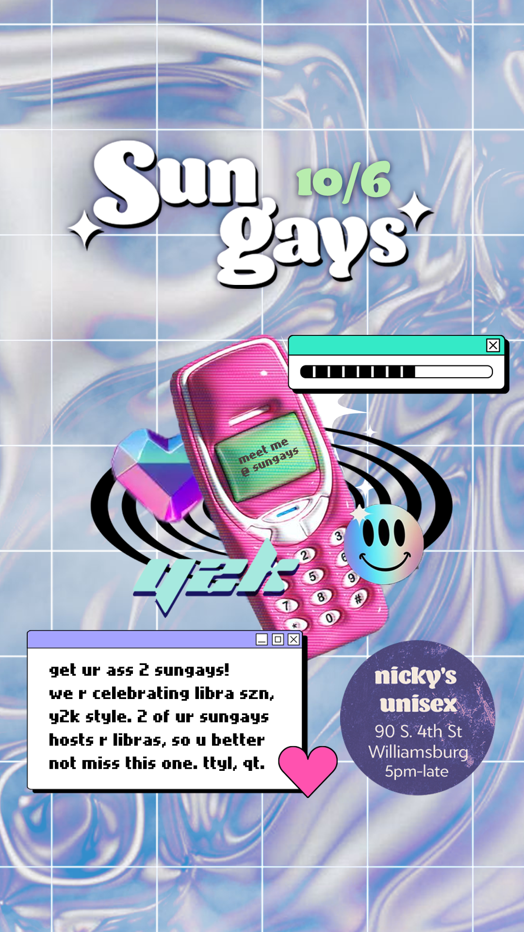
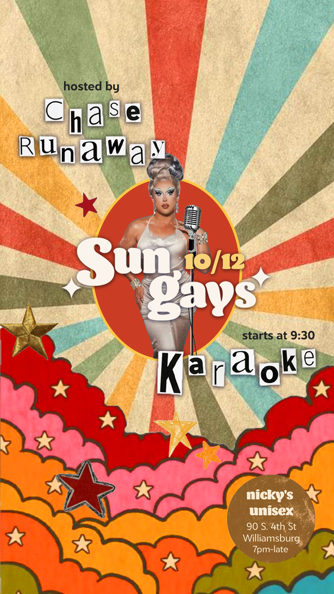
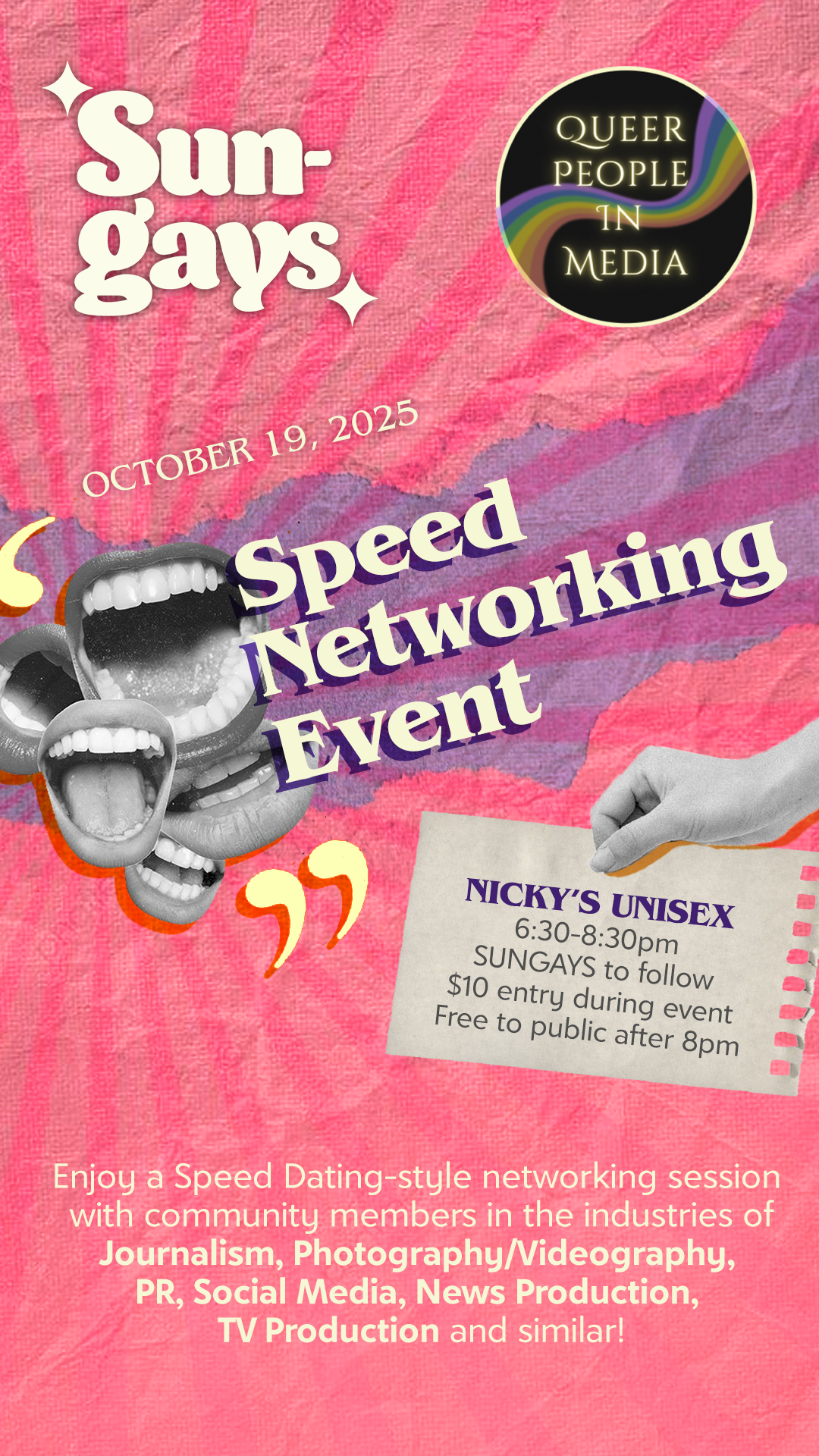
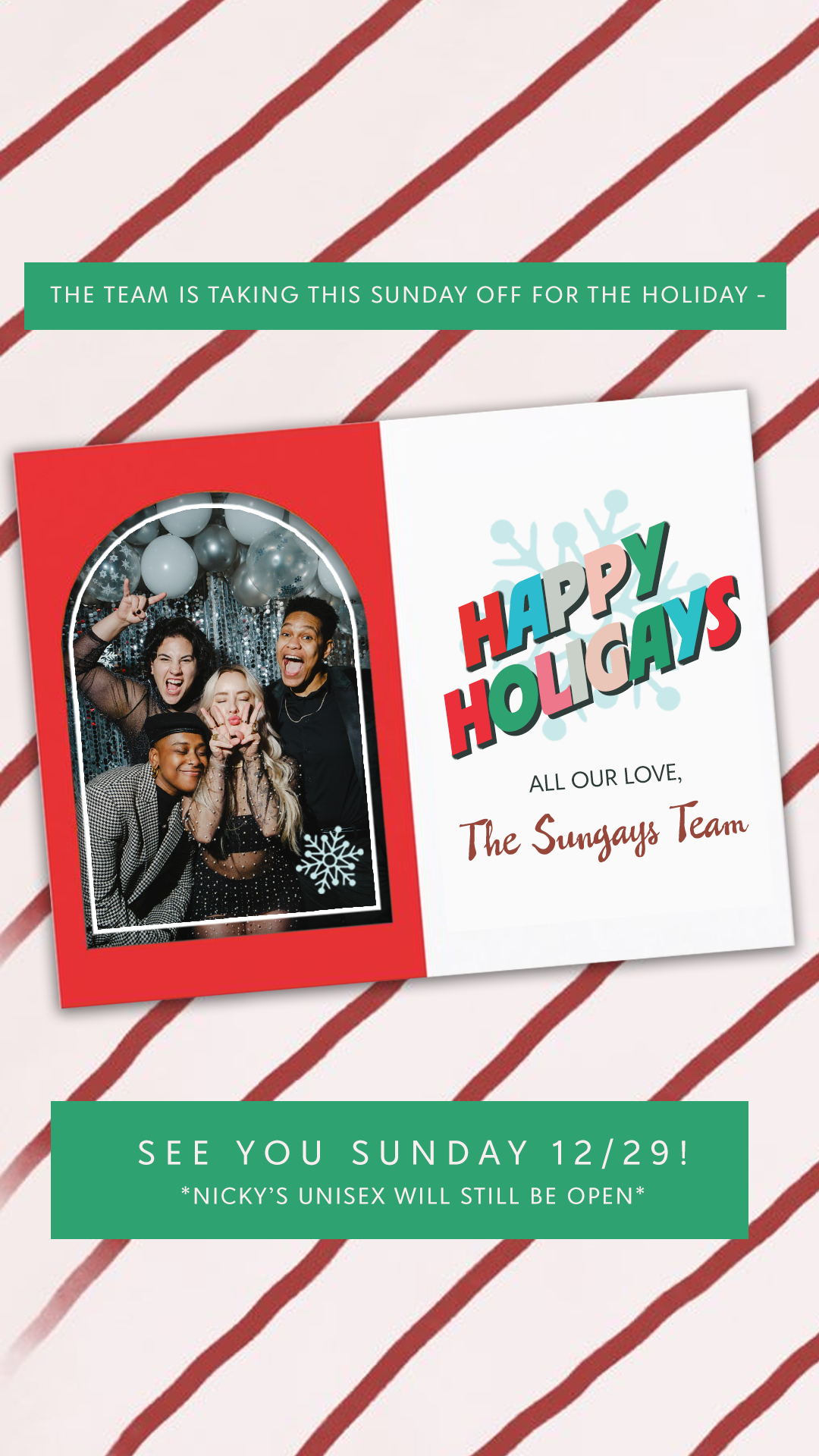
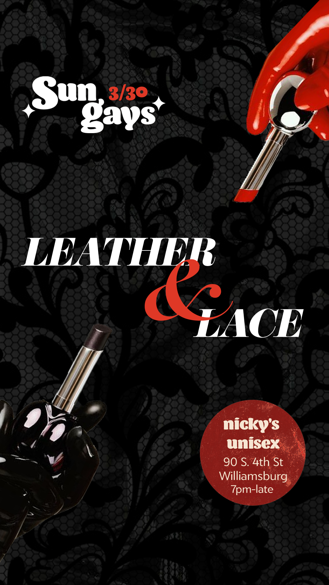
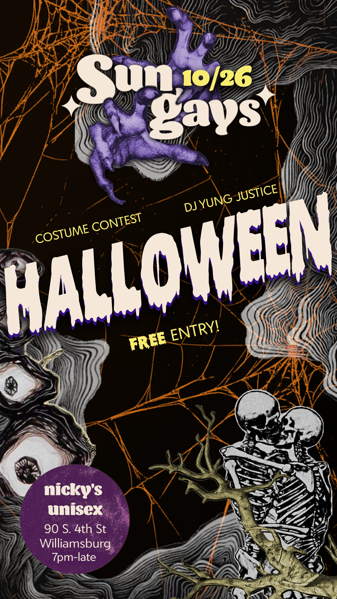
Because each week was different, I wanted the design method to be consistent wherever possible. I relied on a collage-esque style, making interesting compositions out of imagery related to that week's theme. The logo was able to be applied in just about any size or configuration, bold enough to be instantly recognizable but also able to blend in to whatever theme was reflected in the flyer.
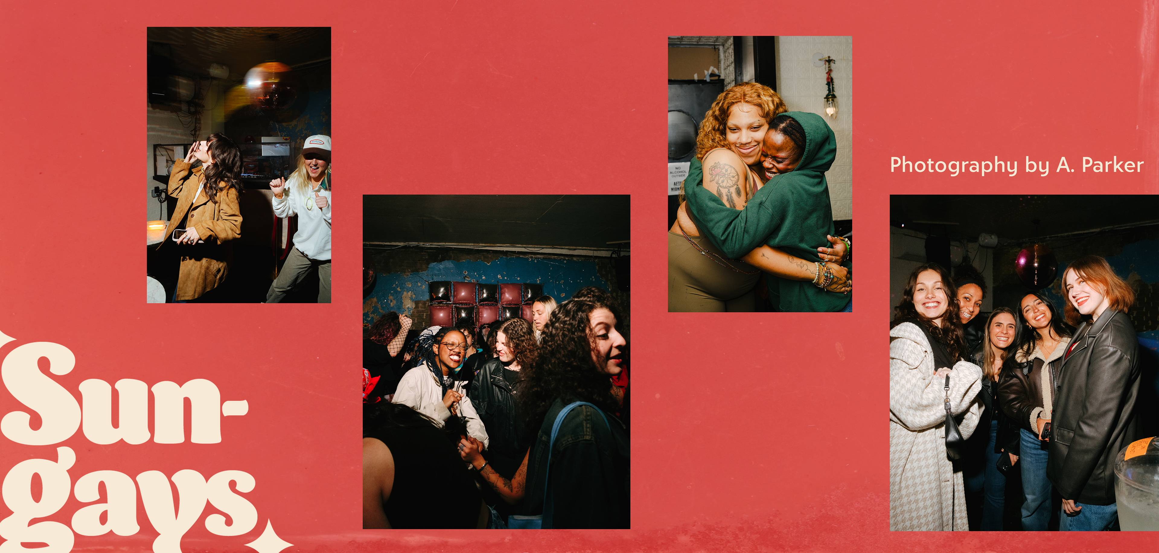
Photography by A. Parker
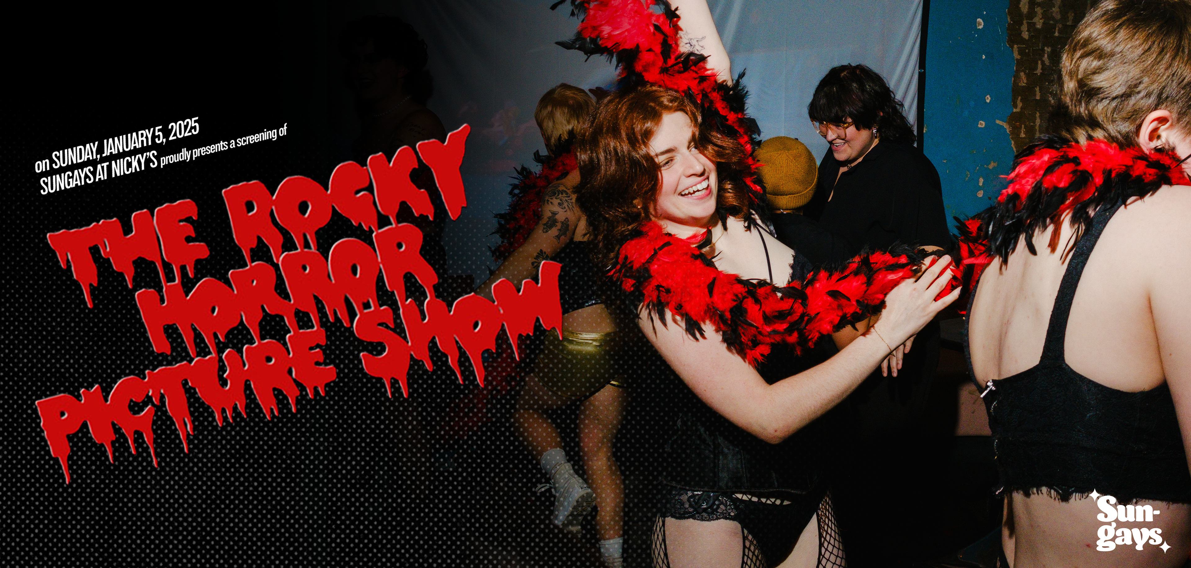
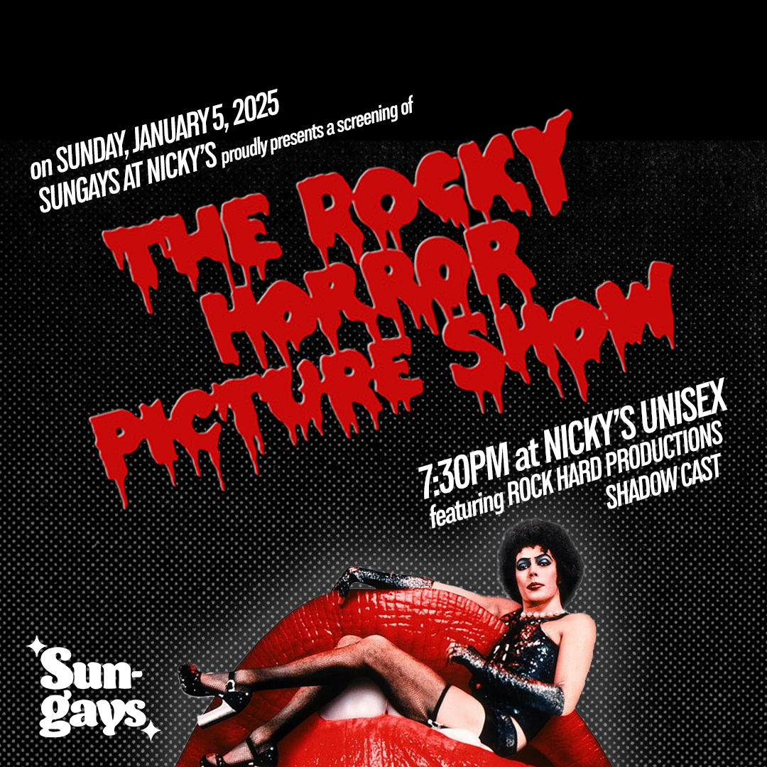
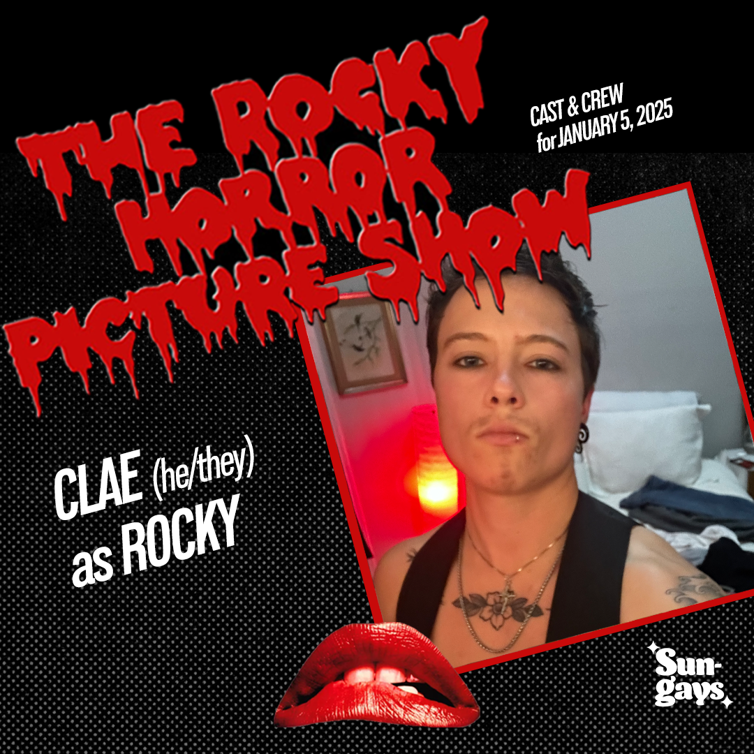
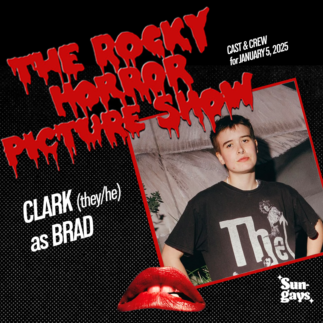
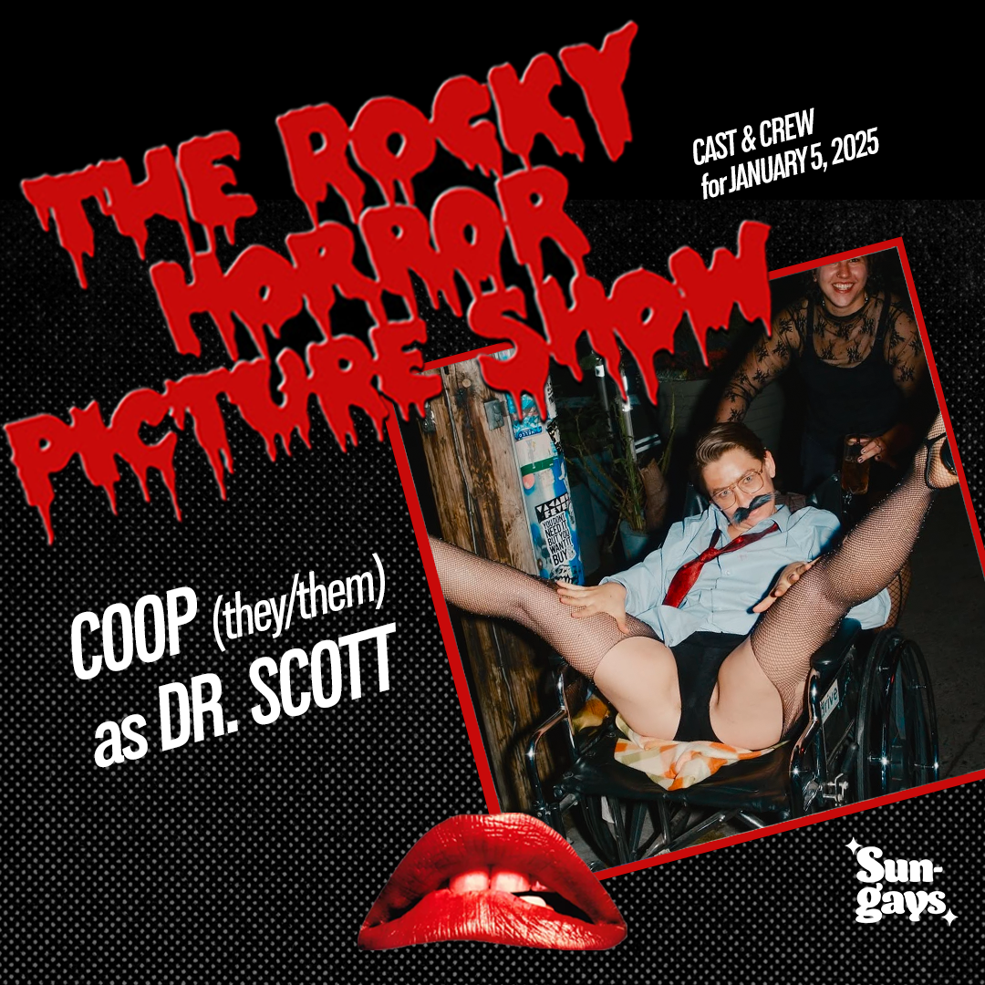
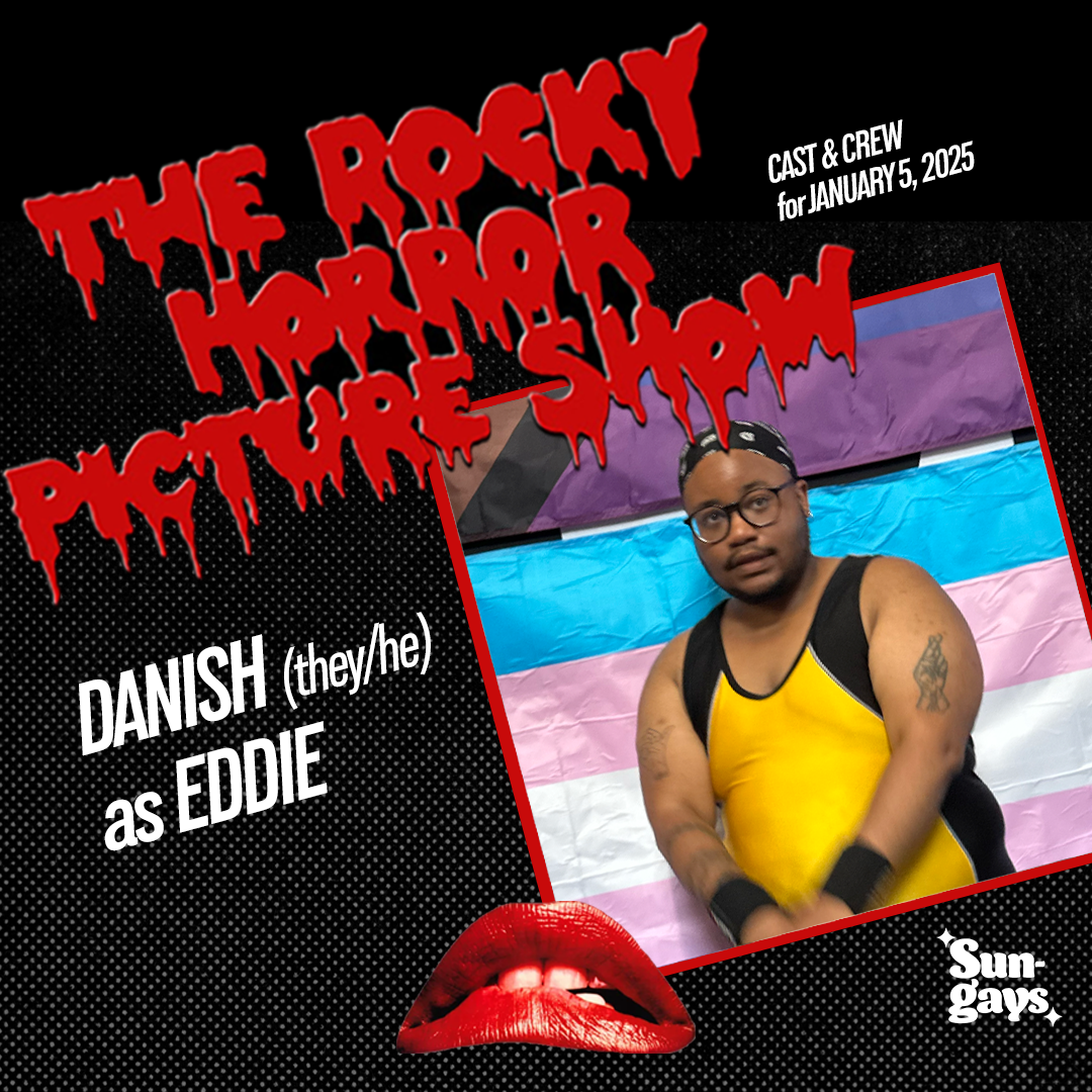
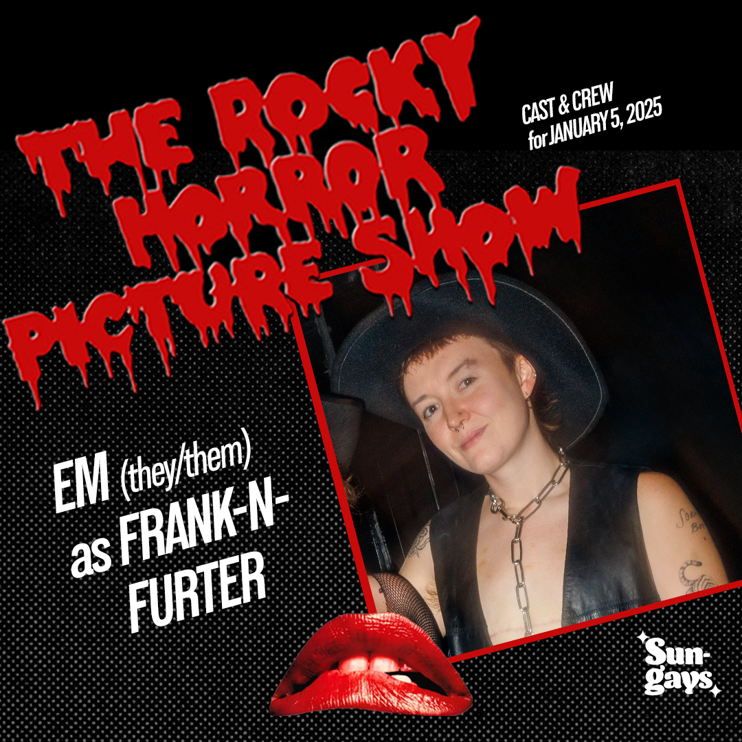
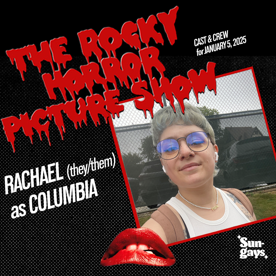
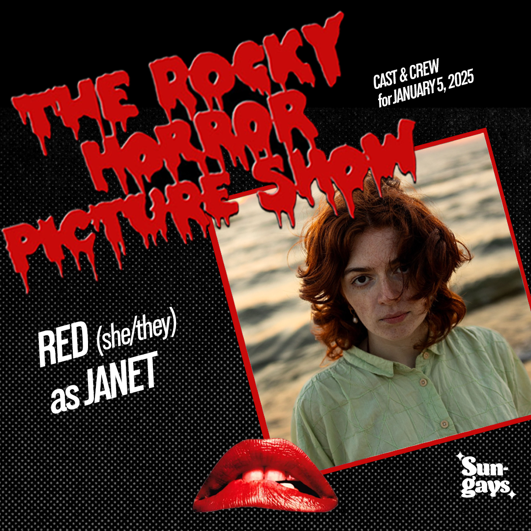
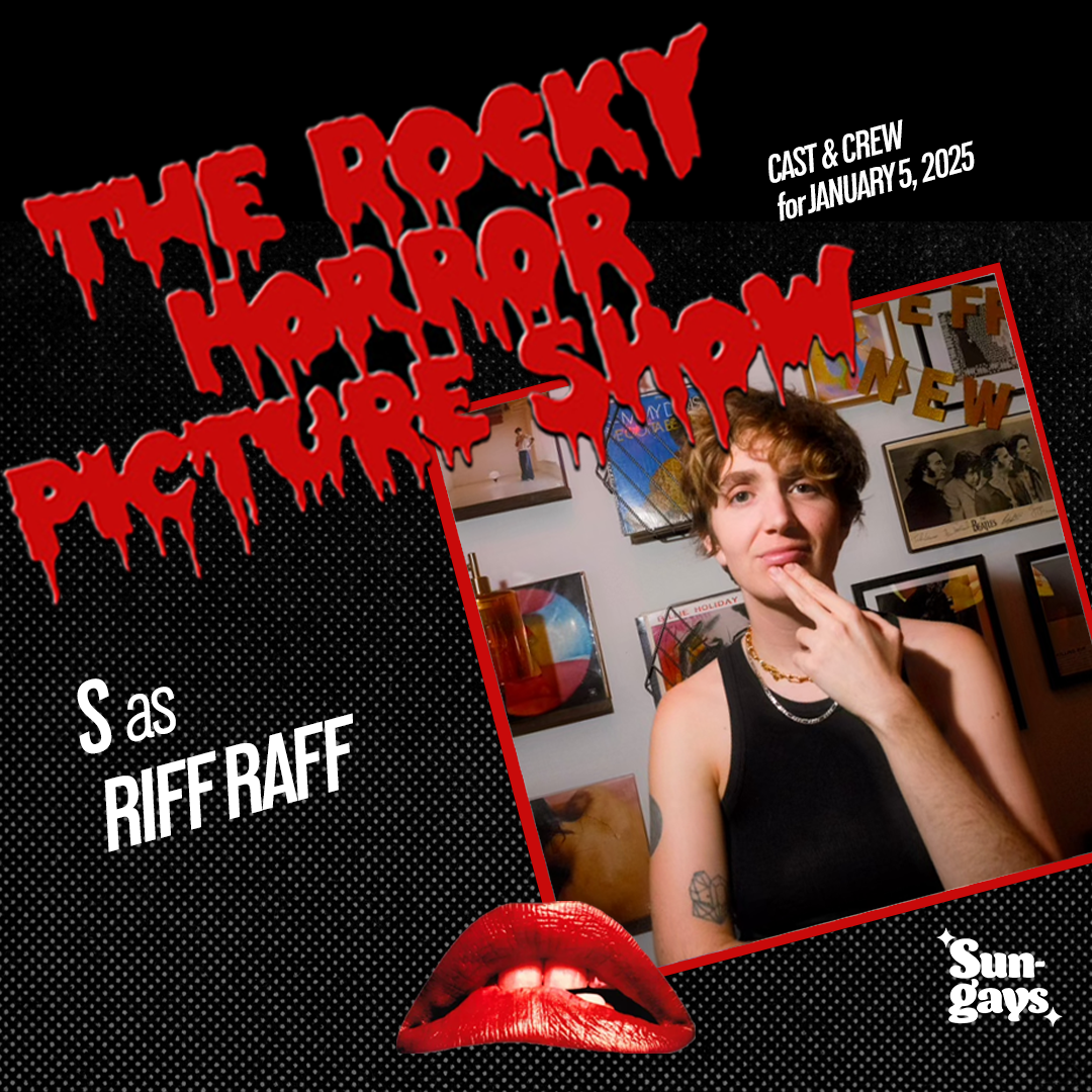
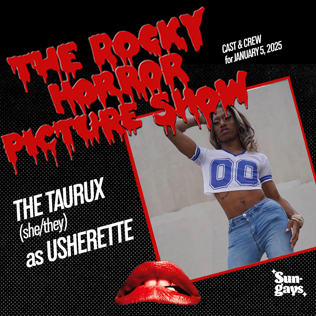
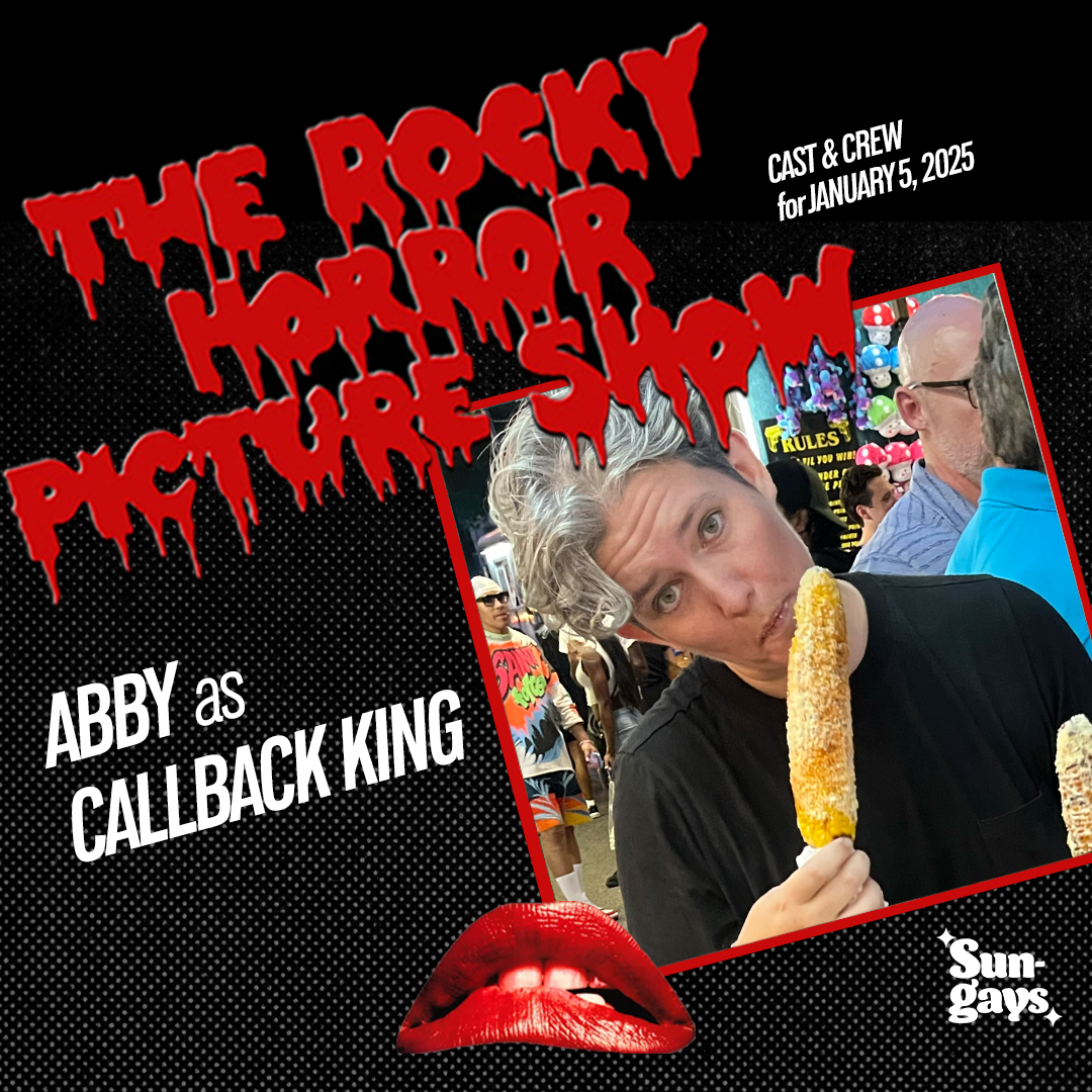
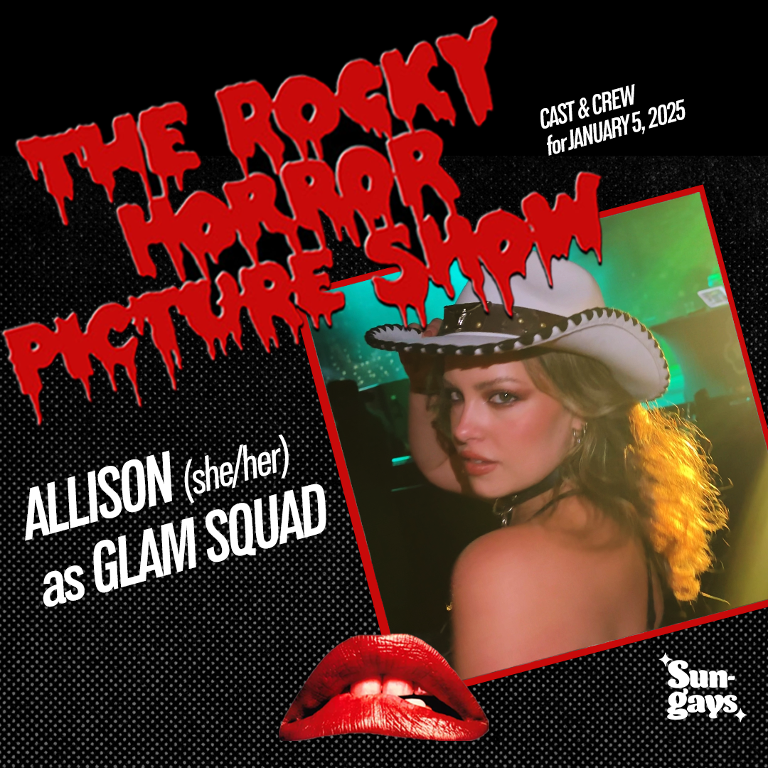
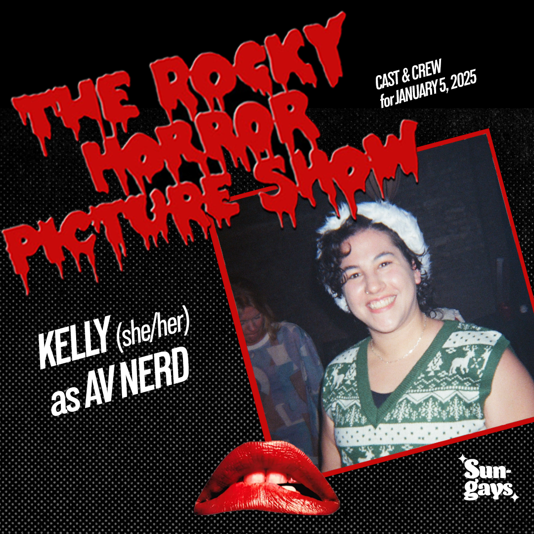
One of our most significant projects at Sungays was hosting a shadow cast performance of The Rocky Horror Picture Show. Along with being the A/V Nerd and setting up the tech for the movie to play, I also designed the main flyer and a multitude of flyers for the cast announcement.

The Final Sungays
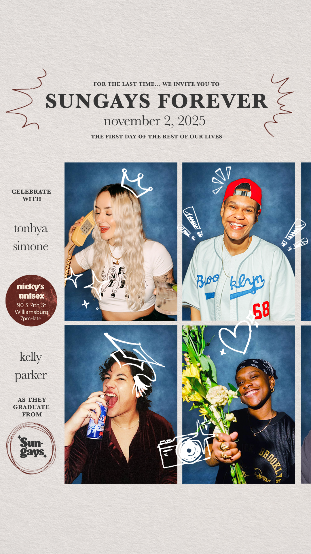
It was rare that I included the hosts' faces in flyers, but it felt important to do so for the last Sungays event. In this design, I wanted to communicate a sense of growing and maturing, intentionally going against the rules I'd set for myself in past flyers: piece-y, layered, approachable, controlled chaos. I opted for a classic serif font instead of our brand font and arranged our photos in a clean grid like you would see in a yearbook. To bring back in the element of fun and familiarity, I added doodles to the yearbook page.
And that's a wrap on Sungays! Helping run this event made me a better person and designer. It was a wild ride that I'll remember forever. Thanks for scrolling!